Band 8.5 — Pie Charts: Age Structure in Three Countries
📄 Bài mẫu band 8.5
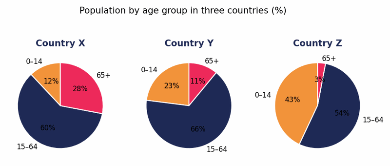
The three pie charts compare the age structure of the populations of Countries X, Y and Z, each divided into children, people of working age and the elderly.
Overall, the three nations present sharply contrasting demographic profiles, ranging from the ageing society of Country X to the strikingly youthful population of Country Z, with Country Y occupying an intermediate position. In every case, however, the working-age group forms the single largest segment.
Country X is plainly the oldest society. More than a quarter of its people, at 28%, are aged 65 or over, the highest such share of the three, whereas children account for a mere 12%, the smallest proportion in any chart. Country Y, by contrast, displays a more balanced profile, with two-thirds of its population of working age and children, at 23%, roughly double the elderly share of 11%.
Country Z, meanwhile, is essentially the mirror image of Country X. Almost half of its citizens, at 43%, are under fifteen, whereas a tiny minority of just 3% have reached 65. Its working-age share, at 54%, is consequently the lowest of the three.