Band 8.0 — Line Graph: Electricity Consumption in Two Countries (1990–2020)
📄 Bài mẫu band 8.0
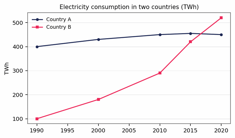
The line graph compares the amount of electricity consumed in two countries, measured in terawatt-hours, over the period from 1990 to 2020.
Overall, consumption in Country B grew dramatically throughout, whereas the figure for Country A rose only modestly before levelling off. As a consequence, Country B overtook Country A shortly after 2015.
In 1990, Country A used four times as much electricity as Country B, at 400 TWh against just 100 TWh. Over the following two decades, its consumption climbed gradually to 450 TWh in 2010, after which it remained essentially unchanged, ending the period at the same level.
Country B, by contrast, presented an entirely different picture. Its consumption rose rapidly at every interval, reaching 290 TWh in 2010 before accelerating to 420 TWh in 2015, almost matching Country A. By 2020 it had climbed to 520 TWh—more than five times its original figure and some 70 TWh higher than that of Country A, whose growth had by then stalled completely.