Band 8.0 — Line Graph: Birth Rates in Two Countries (1950–2020)
📄 Bài mẫu band 8.0
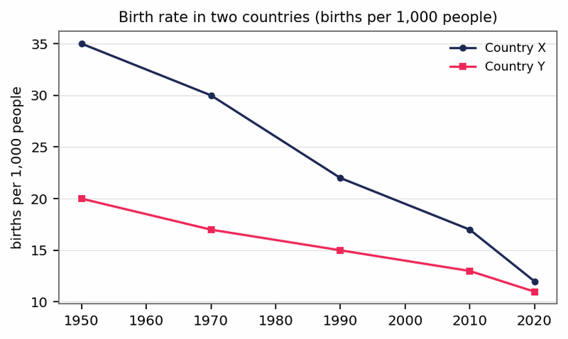
The line graph compares birth rates, expressed as births per 1,000 people, in Country X and Country Y over the seven decades from 1950 to 2020.
Overall, the birth rate declined in both countries across the period, but the fall was considerably steeper in Country X, so that the two rates had almost converged by the end.
In 1950, Country X recorded 35 births per 1,000 people, nearly double the figure for Country Y, which stood at 20. Over the following decades, the rate in Country X dropped continuously, sliding to 22 by 1990 and then to 17 in 2010, before reaching a low of just 12—roughly a third of its original level—by the close of the period.
Country Y, by contrast, experienced a far gentler decline. Its rate slipped gradually from 20 to 15 between 1950 and 1990, thereafter edging down to 11 by 2020. Consequently, the gap between the two countries, which had stood at 15 births per 1,000 in 1950, narrowed to a mere one by the final year.